
MK by Mian Kashif
Luxury logo, brand identity and 21-page brand guidelines for a fashion brand for men and women.
About the project
MK is a fashion brand for men and women that wanted the presence of an international label. The promise is in its tagline: Made to Look Perfect.
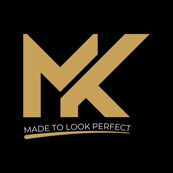
I designed the identity from the ground up: a bold MK monogram built on a 45-degree grid, where the M keeps a short right stem and the K's diagonal cuts straight through it like a clean seam in a tailored garment, finished with a hand-drawn gold brush stroke under the tagline.
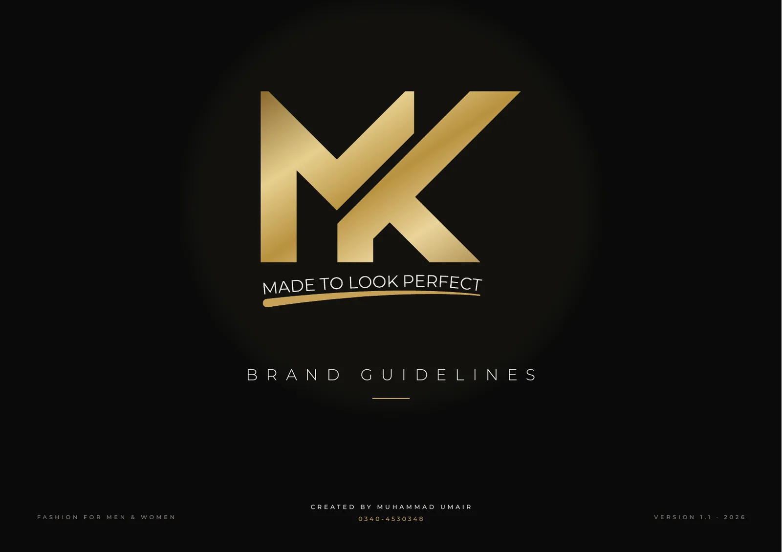
The 21-page brand guidelines set the rules for everything that follows: three logo versions, clear space and minimum sizes, a Black, Gold and Pearl colour palette, Montserrat typography, a monogram pattern, misuse rules, and the brand in use on a reception wall, shop signage, hang tags, stationery, packaging, apparel and social media.
What I did
- Logo and monogram design
- Tagline lock-up and brush stroke
- Primary, logo-mark and horizontal versions
- Construction grid and clear space
- Black, Gold and Pearl colour palette
- Montserrat typography system
- MK monogram brand pattern
- Signage, packaging, stationery and social mockups
- 21-page brand guidelines document
The identity in numbers.
Logo, colours, type and the brand in use.
Want results like MK by Mian Kashif?
Tell me about your business on WhatsApp and I'll show you how I'd approach it.